Beware of the Writing on The Wall – Part 3 - A Change In Mentality
By Mike Fortunato, CIM®, FCSI®
image: https://www.flickr.com/photos/notionscapital/5455358198
Although the indices dipped slightly in the late summer of 2007, both the Canadian & US markets had recovered by October of that same year. During that same period at our branch, our equity mutual fund poster continued to be an attraction for many of our clients. I vividly recall how the double-digit returns on display sparked many conversations that ranged from transactional chit-chat to requests to speak with our advisors. As 2007 was coming to a close, excitement among our clients had reached its peak; little did they know that the rollercoaster ride was just about to begin.
Fast forward less than one year, to the summer of 2008, and the mood had certainly changed. The Canadian market, which showed positive signs in the spring of 2008 was back where it was a year earlier. The US market, on the other hand was doing much worse and was down approximately 15% from the level it was when the equity mutual fund poster first appeared at our branch. The mood of the clients was also beginning to shift. Those that were covetous a few months earlier were now much more cautious. My favourite client, the man who just a few months ago was excited to give me his weekly, bullish market prognostications, was now probing me about when I thought the market would rebound.
By early fall of 2008 things had taking a precipitous turn for the worse. Both the Canadian & US markets were approximately 30% lower than they were the preceding year. Any hope that was remaining at beginning of the summer had now transformed into panic. Much of the losses accumulated in those months in 2008 were concentrated in a few extremely volatile days. This took many investors by surprise and left them holding portfolios with massive unrealized losses. My branch was somewhat of a microcosm of what was happening on a global scale. The same clients, who just a year earlier were so intrigued by our equity fund’s potential return, were now desperately in search for any means to stop the pain.
In an effort to buttress their deflating economies, central banks around the world began aggressively lowering interest rates in their respective jurisdictions. During 2008 alone, the Bank of Canada lowered its key overnight rate almost 3% (from just over 4% all the way down to 1.5%). Although this rate easing would eventually sow the seeds of a slow recovery that would take about four years to materialize, its initial effects were to dramatically distort the fixed income markets throughout Canada. It was during this commotion that our branch eventually removed the equity mutual fund poster that had caustically arrived as the market was reaching its peak, about a year earlier. The new poster that replaced it, however, was no less ironic in its timing and implications; it’s caption read: “Guaranteed Investment Certificate”, and it offered terms that ranged from 1 year to 5 years.
At the time we were still in the middle of a market meltdown, and I can completely understand why banks would choose to remove the equity mutual fund poster that boasted double-digit historical returns. After all, those performance numbers were certainly no longer acculturate, and could easily spark resentment with many investors who were still experiencing the pain from the bear-market that had no end in sight. The idea of a guaranteed investment must have gleamed like a light beacon to the many clients that were watching their portfolios slowly evaporate away. Sometime during the 2008, I recall noticing that the other competitor banks also took similar actions by eventually replacing their equity mutual fund posters with GICs posters. Unfortunately for all investors, due to the dramatic shift in our yield curve, I don’t recall seeing any GIC’s offering more than 1.5% (regardless of the term). That is the nature of any market; when investors rush into a security, the price of that security rises. In this case, investors were rushing into an investment that offered a guarantee of principal. Speculation had taken a back-seat to safety, and that spike in the demand for safety had a tremendous effect on its cost: the cost being the fact that you would earn almost nothing for locking up your money for one to five years.
Beyond earning almost nothing, there was also a huge hidden opportunity cost embedded into those GICs due to the fact that your investment is locked up for the term of the GIC. As I mentioned in part 2 of this article, going back to 1956, the average bear-market in Canada & the USA have historically lasted around 9 to 14 months, and by the time it took both markets to drop about 30% from their 2007 high, an entire year had just about passed. So, on a historical basis, the bear-market that was causing our clients to panic was actually coming close to its end. But as is normal in both bull & bear-markets, most investors and commentators seem to believe that “this time will be different”. Looking back in hindsight, we can see that the bear-market during the 2008 Financial Crisis actually lasted about 11 months in Canada and 16 months in the USA, which was very much in line with the historical averages. So, for an investor motivated by fear, locking into a GIC for a long-term in the latter part of 2008 meant missing out on the recovery that followed.
Below is graph to illustrate my point:
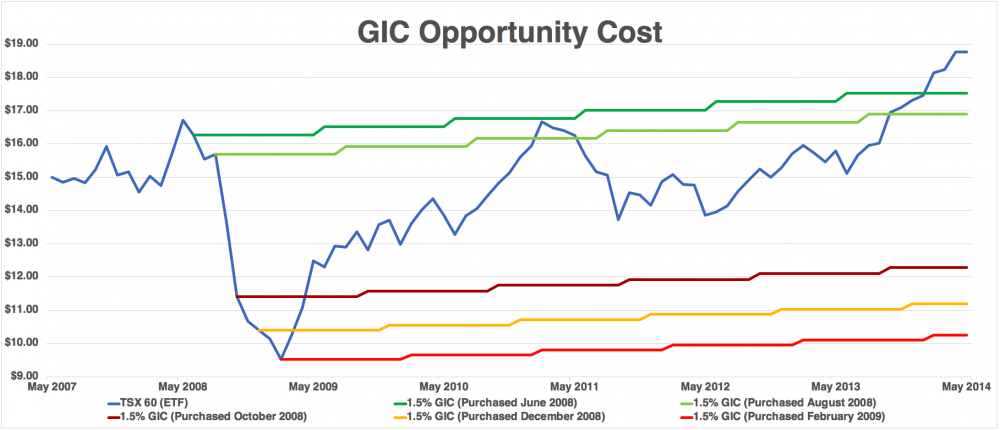
The blue line above represents the price of iShares’ S&P/TSX 60 Index ETF (adjusted for dividends & splits). The movement of that line is analogous to the movement an investor’s portfolio would undergone during the seven-year period between May 2007 – May 2014. As you can see, an investor would have experienced a dramatic loss early during the financial crisis between May 2008 – Feb 2009. The five other coloured lines are the theoretical return an investor would have received had they sold out of the market and immediately invested in a GIC paying 1.5% per year. The green lines represent investors who made that switch in June 2008 & August 2008. They managed to enjoy all the gains of the bull-market while also avoiding all the pain of the initial drop in 2008. Even the best investors rarely display such perfection in timing and foresight. It is important to note that just staying the course and riding the blue line eventually becomes the winning bet near the end of our chart (in May 2014), and shows a massive outperformance had I extended the chart all the way to present day (mid-2018, where GICs are still paying less than 2%). The red lines at the bottom of the graph show a more realistic representation of what a panicking investor might have experienced. After all, the bulk of the losses occurred in the span of just two months just after the summer of 2008. For most inexperienced investors, their capitulation would have probably occurred after that big drop.
As a bank teller during the Financial Crisis I was observing this dynamic play out in real time. The graph above displays blue, green and red lines, but to me, those lines represent actual investors I knew and interacted with on a daily basis. Some held onto their investments and rode out the storm and eventually recovered all their losses, while others threw in the towel at or near the bottom of the market and haven’t invested in equities since. Witnessing the forces of fear and greed in a Behavioural Finance context taught me valuable lessons about investment suitability, and the interaction between an investor’s time horizon and their risk tolerance, that I still leverage to this day. Many of the clients at our branch were lucky that they had relationships with our branches advisors as they were given guidance during the market turmoil. Unfortunately, any investors who took their cues from posters often found themselves invested in good securities, but at the worst possible time.